Inner Ashes Review
Nintendo Switch
Forgetting everything is only half of the journey.
Reviewed by JustAnotherJake on Jul 13, 2023
There are a lot of narrative-driven games that heavily focus on providing a story told in an interactive state. Many of these games rely on other elements to make them worthwhile to their players. Whether it is a large focus on puzzles, horror, or a branching storyline, these types of games come in a lot of forms. Lately, there have been a lot of indie games in this vain, so making them different from one another is usually down to what the story has to tell or the way it is shown visually. Inner Ashes is another one of those games and its narrative can be a bit emotional at times, but what it has in terms of a game may be a bit on the questionable side of things.

Without getting into the depths of the game, Inner Ashes feels like it doesn’t work as a video game. Maybe as a sort of virtual reality-based experience, but the puzzles don’t play off of the direction the game is going with and instead, it offers very typical gameplay options, making it what many would call a walking simulator, and it really isn’t too off of the mark. The gameplay, for the most part, is just about walking from one point to another while interacting with very specific things to trigger in-game events or dialogue. This hurts as the narrative is pretty good, and it acts as the only element that is engaging enough to want to play any further.
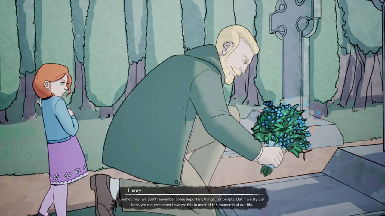
As mentioned prior, the narrative in Inner Ashes is good and may tug at some heartstrings for those who really get invested. Inner Ashes has its story focused on Alzheimer’s disease and its effects not only on the person with it but also the effects it has on the people surrounding the affected individual. It is a deep topic to cover and one that is not covered in gaming much at all. The narrative uses this as a way to play into a sort of sense of mystery, and it works for the most part. Some elements feel thrown together just to have them fit the fact that it is indeed a video game and not just a written story.
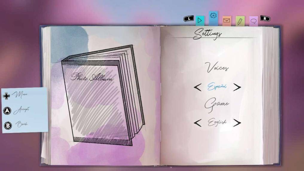
The largest issue with the story found within Inner Ashes comes from the vocal performance. The English performance is almost comical at times and is very distracting when things should be very serious or emotional. Luckily this can be avoided by changing the audio language to Spanish. The game's story comes off much more natural when in Spanish, as it was likely the intended audio. In that case, it should have been the default; however, that doesn’t seem to be the norm with most games. However, confidence in this sort of thing allows for more branches to stem off and for the game to be more recognizable.

In terms of other sound design, everything else is pretty par for the course. There isn’t much to walk away from humming or sharing online how amazing the soundtrack is, but it is quality. That goes for all of the sound design here, and not just in terms of what is there for music. The actual environment sounds are pretty good and are a rather good element of the game. Making things feel a bit more fitting despite the other issue the game has presented throughout its lifespan.
Inner Ashes runs very poorly on the Switch, and there isn’t much room to excuse what is happening here. Often times things will just pop in and out without much of a reason, and the other versions of the game don’t seem to have this same issue. It is always just to the side of what is coming into vision; a place players will often be looking directly at as they move the camera around. This would be more understanding since it is notorious that the Switch is vastly underpowered in comparison to the other consoles in the market, but the Switch has proven it is able to run games way more graphically intensive and demanding than Inner Ashes.
Pop-in isn’t the only technical issue either for Inner Ashes. What seems to be yet another set of issues exclusive to the Switch version of the game are blurry visuals and inconsistent frame rates. The game, at times feels very blurry, making some textures hard to make out, especially on the main menu with the already hard-to-read cursive writing font used to identify the different menu tabs. The blur becomes extra noticeable in handheld mode, making even some of the particle effects a nuisance to look at.

As for the frame rate, the game already takes a long time to load between screens, but it appears that isn’t enough as the game stutters heavily when moving around the different worlds. It is possible that the game is actually a lot more demanding than what would initially seem to be the case, but seeing the other issues the Switch version of the game has, it seems to be a bit of a mystery in and of itself.
Ignoring the technical issues and actually looking at the gameplay of Inner Ashes doesn’t leave much room for more appraisal. As mentioned earlier, the game is more or less a narrative-driven walking simulator, and even then, walking around in the game isn’t very fun. The main area of the game is the main character’s house, and this is by far the blandest area of the entire game, with very generic textures and simple models filling what otherwise would have been an empty space. It is in this house that the walking cycle feels the most broken as the bob for the cycle feels almost robotic. To make matters worse the speed at which the player moves about is painfully slow, and with the lack of a sprint backtracking through areas feels like nothing more than a chore.
There are plenty of interactable objects and notes littered throughout the areas and most of them feel incredibly bland. Notes will pop up on the screen as rectangles with very generic text; looking at something this bland and unpolished makes one think the game is unfinished, and with it being more than just one instance throughout Inner Ashes, it leaves a very sour taste. There are also bits of artwork that will come up that feel out of place and not at all within the game's art style, so yet again, there is something that simply leaves a sour taste with the presentation of the game. These pieces of artwork are pretty prominent throughout the game, especially towards the end; making the art a bit more detailed or making the game's art style fit better with these pieces would make the game's art feel more aligned.

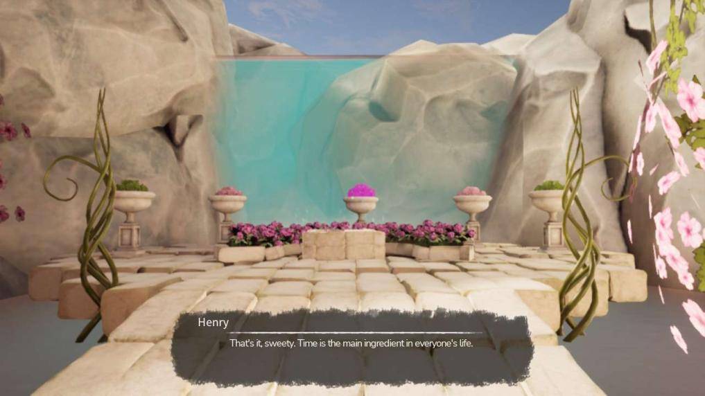
Surely with the majority of the early game being such an unpleasant visual experience, the rest of the game would fit the same boot. This couldn’t be further from the truth. The dream world segments are actually quite well designed from an artistic point of view. Floating islands with massive trees, orange valleys covered by a bright sky, and more areas give the game a truly interesting and unique feel. It is actually a great treat for the worlds to look so interesting, and while the actual levels don’t really interact with these amazing set pieces, at no point do they take the view fully away, aside from when the level ends or it is mandatory to revisit the home from the beginning.
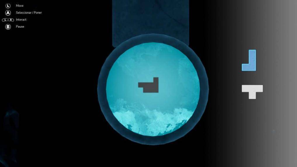
While the levels look amazing, aside from the awful graphical issues brought on by the Switch, they never really use the level design to integrate any sort of gameplay gimmicks. It is all super simple situations like walking to an object, interacting with it, and then walking to another point to interact with another object until a new dialogue pops up. It is rinse and repeat the whole way through Inner Ashes. There are puzzles but never anything you’d fully crave out of these dream worlds. Even when there are puzzles to solve, they never take up much time or brain power to serve their purpose. To some players, the difficulty of the puzzles may come off as something akin to a joke; however, it is also a possibility that the puzzles were made easier to be more accessible to those who don’t typically play video games.
Speaking of time, Inner Ashes sure doesn’t have much of it, as the game can be completed in about two hours or less. That is incredibly short for a game with almost zero replay value. Sure, the story may be worth the experience, but the whole package sure doesn’t prove its worth. There is nothing wrong with a short game, as long as it can justify its length in other means by providing different experiences or something groundbreaking, but Inner Ashes really doesn’t have anything that really warrants it being called a full game if it can barely fill up two hours of someone's time. In order for Inner Ashes to feel like it has some actual playtime value, it should have included some features like alternate pathways that tell some more hidden details about the story or even an alternate storyline that could unfold.

The main problem with Inner Ashes as a whole is that it is supposed to be a video game while not offering that full interactive experience. As mentioned prior, the VR space would work excellently for this game with the dream worlds and the basic puzzles, but then again, that isn’t the point of the narrative. This sort of story would feel so much more impactful if either the game felt more intertwined with some gameplay mechanics or if it cut the whole gameplay idea out and made itself something entirely new, like an animated short film. In fact, a lot of this game would feel better if it were a film or short instead. It would absolutely fit the bill for it being shorter, and rather than a replay of the game, it would be a rewatch of the story.
It is pretty obvious that there is something within Inner Ashes worth talking about and discussing, especially with its narrative based around such a sensitive topic. However, as it stands, it is a game that I foresee most players walking away from this experience, being only able to make it through thanks to the story and maybe the dream world visuals or not being able to finish the game due to the lack of actual gameplay.
The story here is the golden key to it all, and it shouldn’t go to waste, but either Inner Ashes should be something completely different or it needs a lot more time to be developed into something a lot more in-depth than what is here right now.
Editor, NoobFeed
Verdict
The story here is the golden key to it all, and it shouldn’t go to waste, but either Inner Ashes should be something completely different or it needs a lot more time to be developed into something a lot more in-depth than what is here right now.
40
Related News
No Data.

